CHILDREN’S HOSPITAL COLORADO
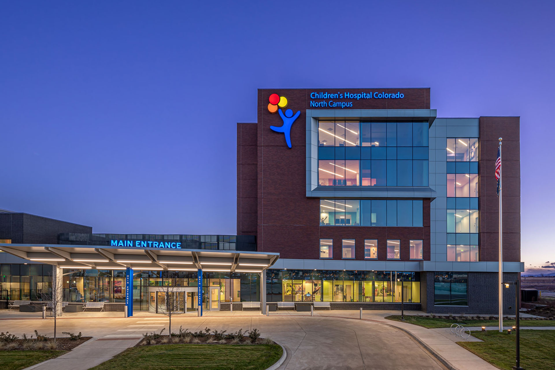
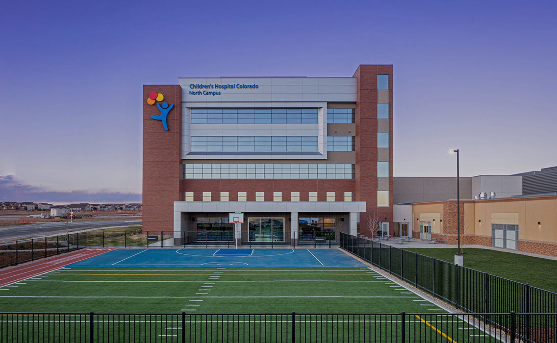
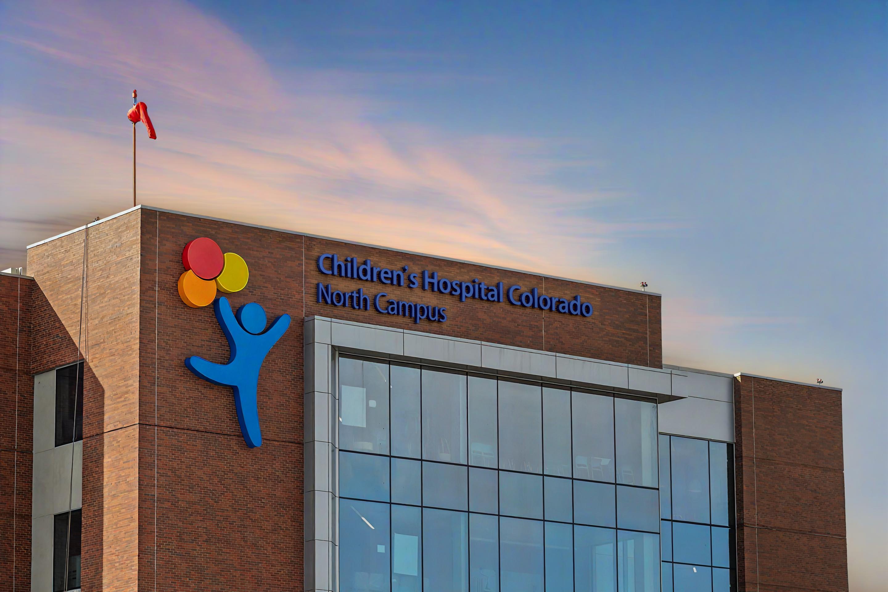
Through 4 different positions I’ve held, I’ve had the incredible fortune and privilege to direct, develop, and integrate signage, environmental graphics, and many types of marketing materials for 5+ Children’s Hospital Colorado locations across the state. For the North Campus, Colorado Springs, and Potomac, my team developed colorful systematic wayfinding programs from the ground up and designed all signage and experiental graphics to bring a bright clear and uplifting wayfinding experience for sick children and their families.
I also drew sign specifications for all sign types for the various locations, and consolidated wayfinding systems to better serve unique signage needs to meet ADA requirments and the everchanginging hospital accesibility needs of the modern world for these spaces over the course of several years.
Art direction on all projects shown here by Clara Carpenter and myself. Fabrication completed by Adlight Group. Original Children’s Hospital branding materials developed by Arthouse Design.
2018 ––– 2024
Art Direction
Marketing Strategy
Signage Design
Wayfinding / Placemaking
Environmental Graphics
Industrial Design
Art Direction
Marketing Strategy
Signage Design
Wayfinding / Placemaking
Environmental Graphics
Industrial Design


ENVIRONMENTAL GRAPHIC DESIGN
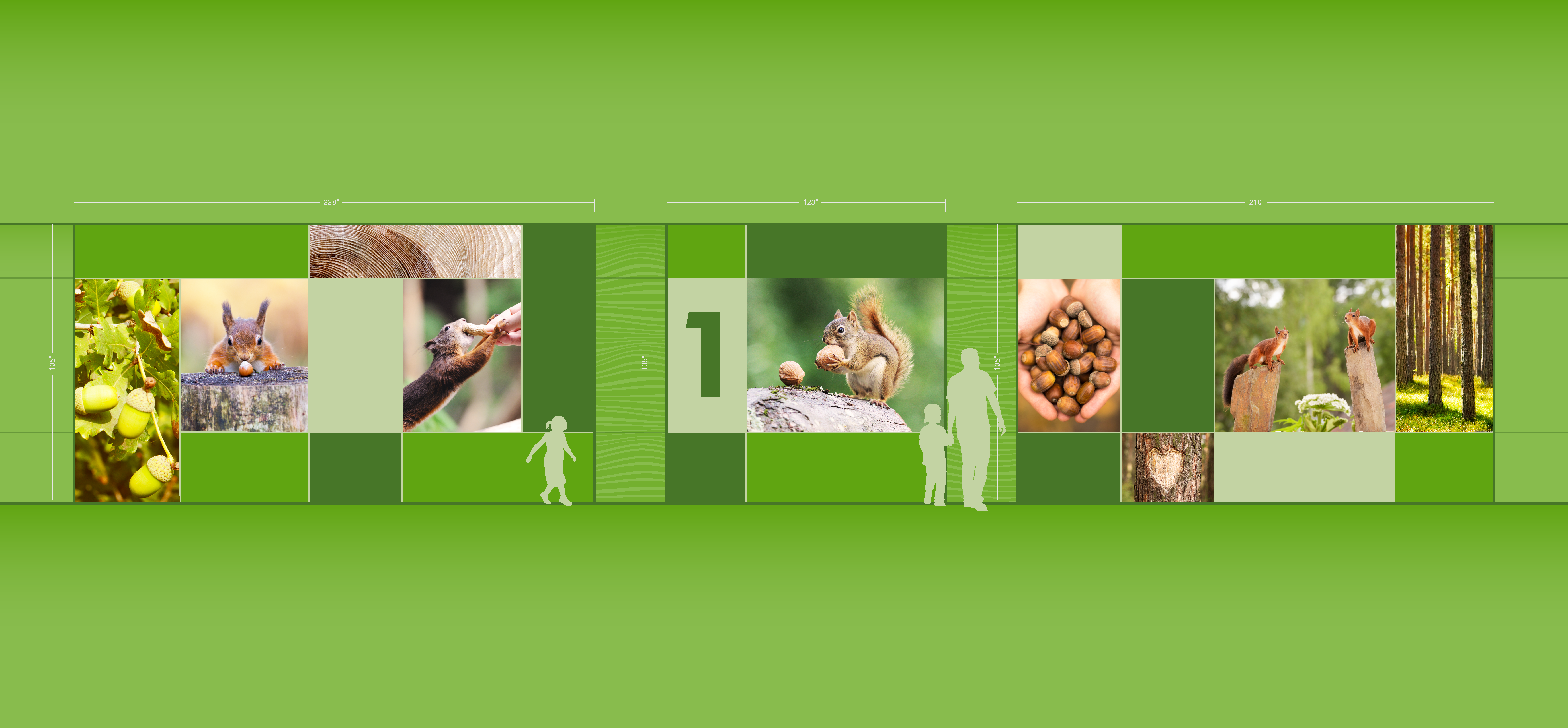
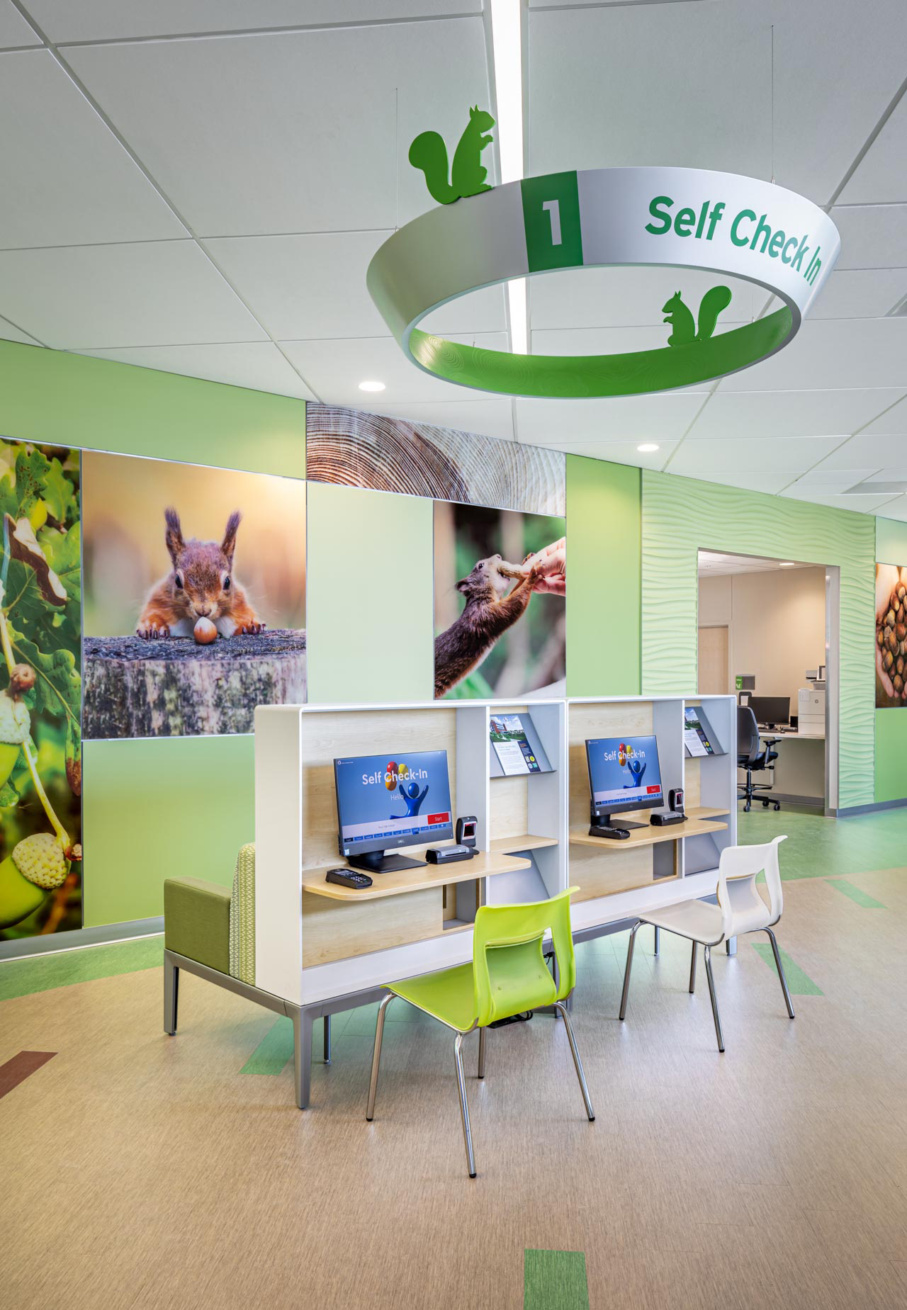
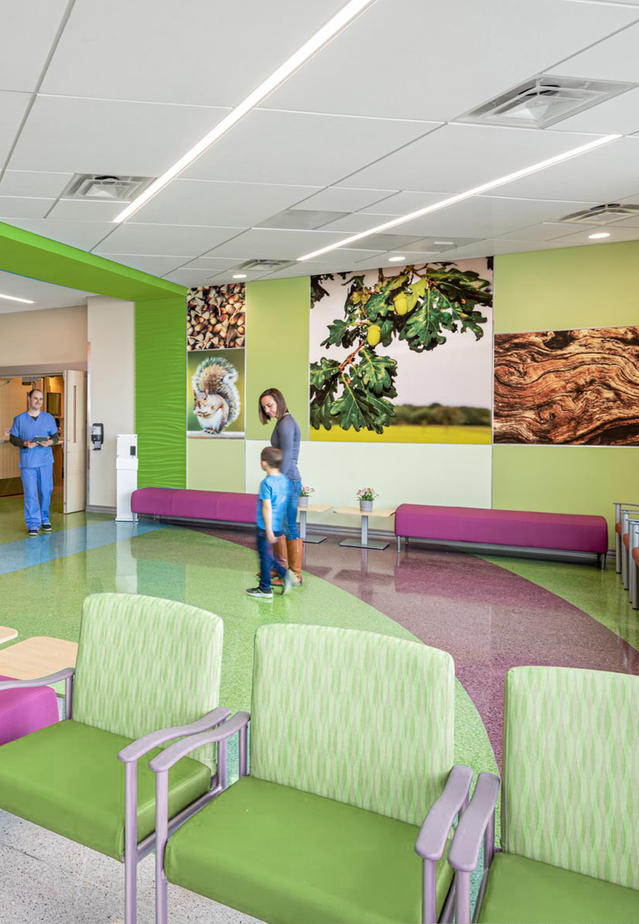
When we designed environmental graphic systems for CHCO, we employed a three-pronged strategy that integrated a color, an animal, and a numeral across different levels of these buildings. This approach was effective in guiding visitors through the complex healthcare space. Different users psychologically latch onto different aspects of the concept, whether through the thoughtful color palattes, familiar animals, or intuitive location cues.
Together, these elements created a cohesive, calming, and approachable environment. It also turned navigation into a fun, interactive “I Spy” experience, while also easing the stressors of an uncofortable and clinical environment. The result was a thoughtfully themed system that not only eased the wayfinding process on a subconcious level but also brought a sense of playfulness and comfort to a potentially stressful experience for families.
WAITING AREA WALL GRAPHICS – Main Campus Radiology Wing
![]()
![]()
WAITING AREA WALL GRAPHICS – North Campus






OPERATING ROOM DISTRATION WALL GRAPHICS
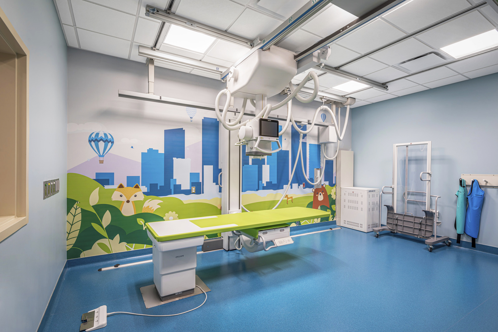
I developed a few “distraction graphics” for several imaging and operating rooms. They do more than brighten the space with artwork. They’re carefully designed with interactive elements that actively engage young patients during procedures and imaging. These graphics turn the walls into a visual treasure hunt, keeping kids focused on searching for hidden objects or characters. By holding their attention, the graphics help to ease anxiety and distract from the medical environment. This not only helps create a calmer experience for the children but also assists medical staff by fostering a relaxed, more cooperative atmosphere during operations.

SIMPLY MASSAGE BRANDING
Simply Massage is a longstanding massage studios in Vail, Colorado. They offer a range of massage services from deep tissue to sports massage, catering to both locals and visitors looking for relaxation after intense outdoor activities. Their services are practical and efficent for an active outdoor oriented clientle with holistic add-ons like CBD or aromatherapy. The studio reflects the natural beauty of the mountains, creating a calm and inviting space for winter sport enthusiests to unwind.
I was hired as the in-house brand designer when they came under new ownership and were looking for a way to refresh the brand that had since felt a little outdated and wasn’t meeting marketing and expansion goals. I started with a new logomark and type treatment and over the years have built out a new brand that is bold, modern, feels accessible to mountain living crowd, their vacationing counterparts; while still feeling friendly, local and accessible to anyone.
2019 ––– 2021
Identity
Positioning & Strategy
Art Directrion
Editorial
Marketing
Packaging
Guidelines
Identity
Positioning & Strategy
Art Directrion
Editorial
Marketing
Packaging
Guidelines


ORIGINAL LOGO AND BRANDING
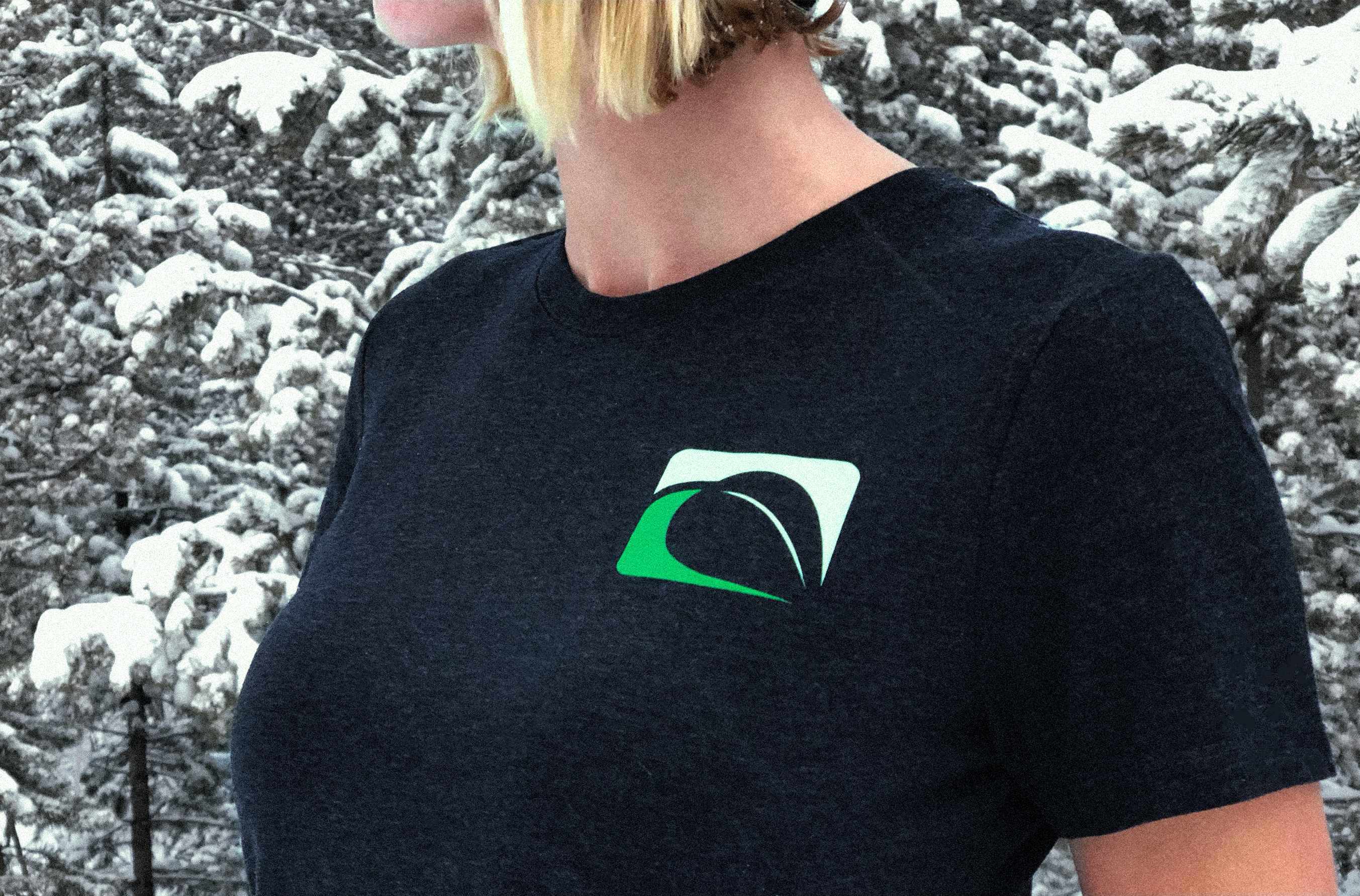
This was the logo I was asked to give an update to. It was important not to alienate their commited customer base of locals, but give the brand a modernized edge to appeal to visitors. The updated logo uses brighter, much more vibrant greens, and a more considered approach to the infamous leaf symbol, while the new lowercase typography communicates modernity, while enhancing readability and impact with a bolder design.

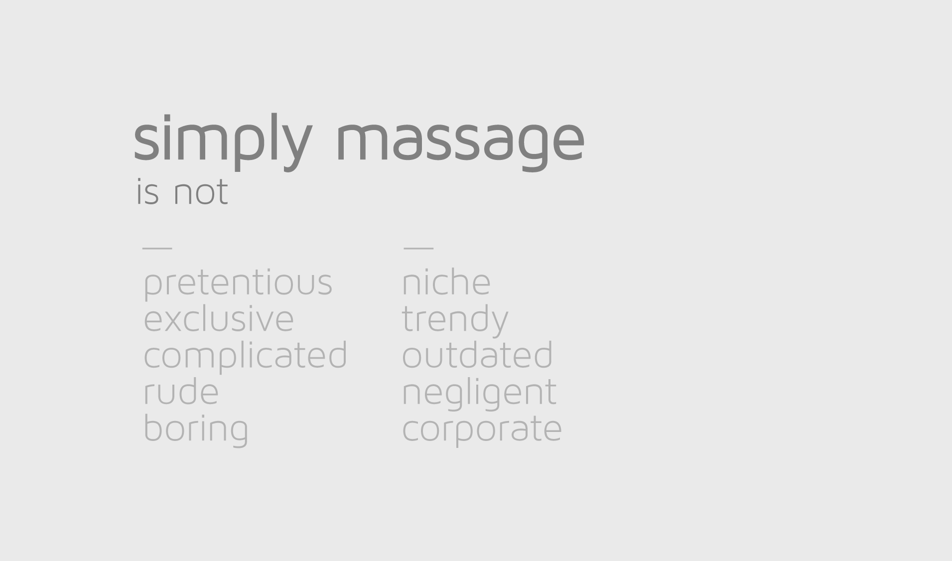
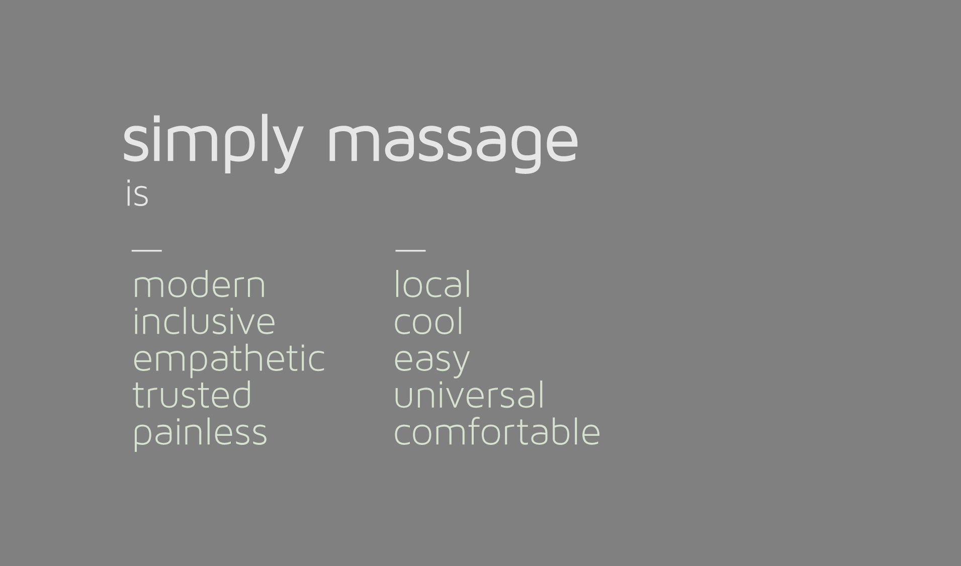
BRAND POSITIONING
BRAND EXTENSIONS


MARKETING MATERIALS
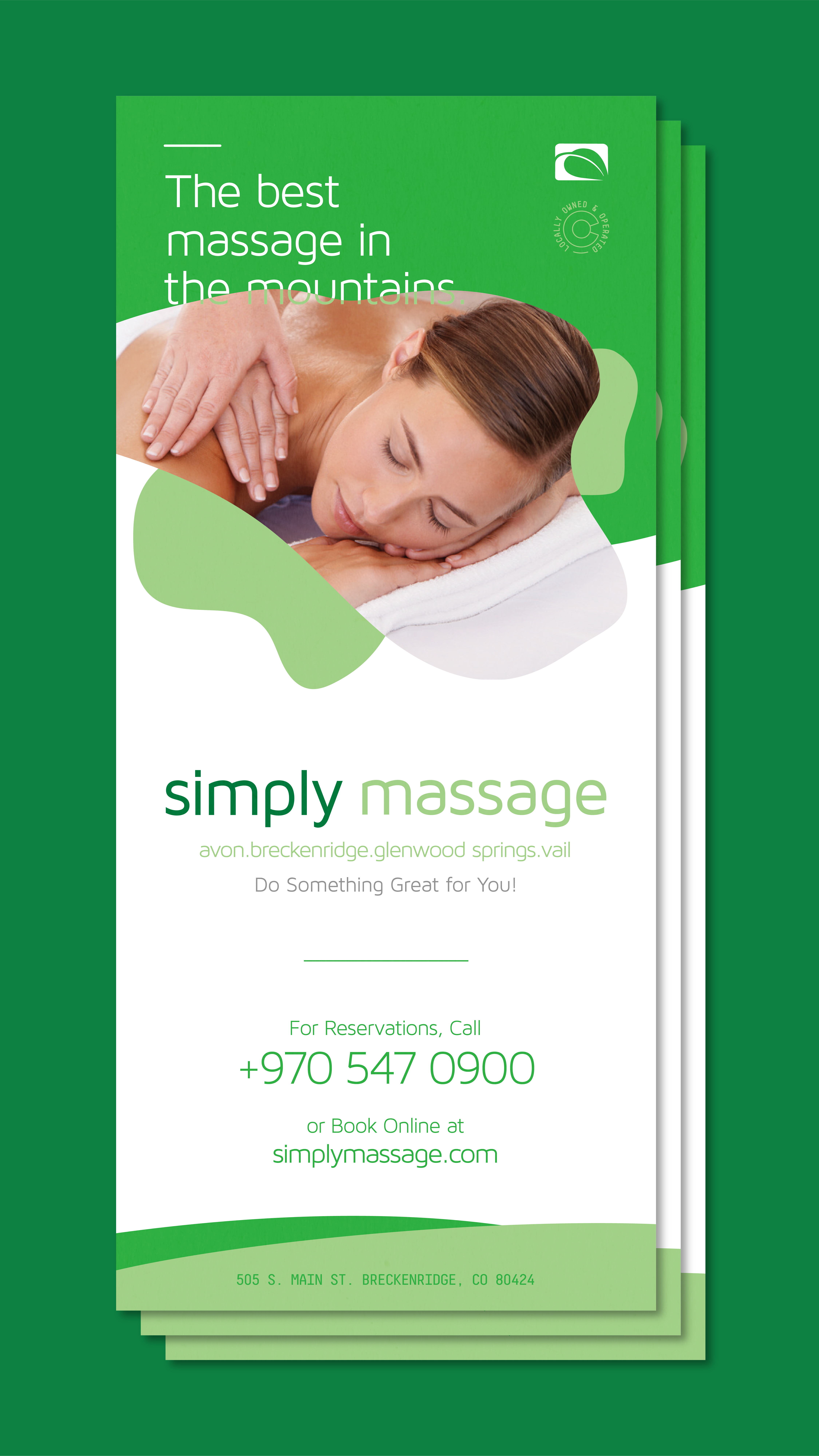
Ongoing design for marketing materials including web, product, print, social media, etc.


CBD PROMOTIONAL WORK
Simply Massage added a CBD upgrade option in early 2020, one of the first in Colorado to do so. I was asked to design a few materials that would incorporate into the brand language I developed that could be used to sell customers on this new healing method. One of which was a 6-page pamphlet for the waiting room highlighting the benefits of adding a CBD upgrade to their massage services. The goal was to communicate the research and effecrtiveness behind CBD's interaction with the body's endocannabinoid system, helping customers understand its potential for reducing inflammation, alleviating pain, and enhancing relaxation. Complete with original illustrations, the pamphlet visually and concisely conveyed the value of incorporating CBD into their wellness routine, reinforcing its effectiveness and benefits in a professional, approachable, and brand aware manner.
![]()
![]()
![]()
![]()
![]()
PACKAGING DESIGN
They soon teamed up with Denver-based Color Up Therapeutics to offer a line of organic, full-spectrum CBD-infused healing products available in their lobby. I designed the labels and packaging, focusing on a clean, minimalist look that reflects the updated brand language and have since sold extremely well.
![]()
![]()
INTERIOR DESIGN


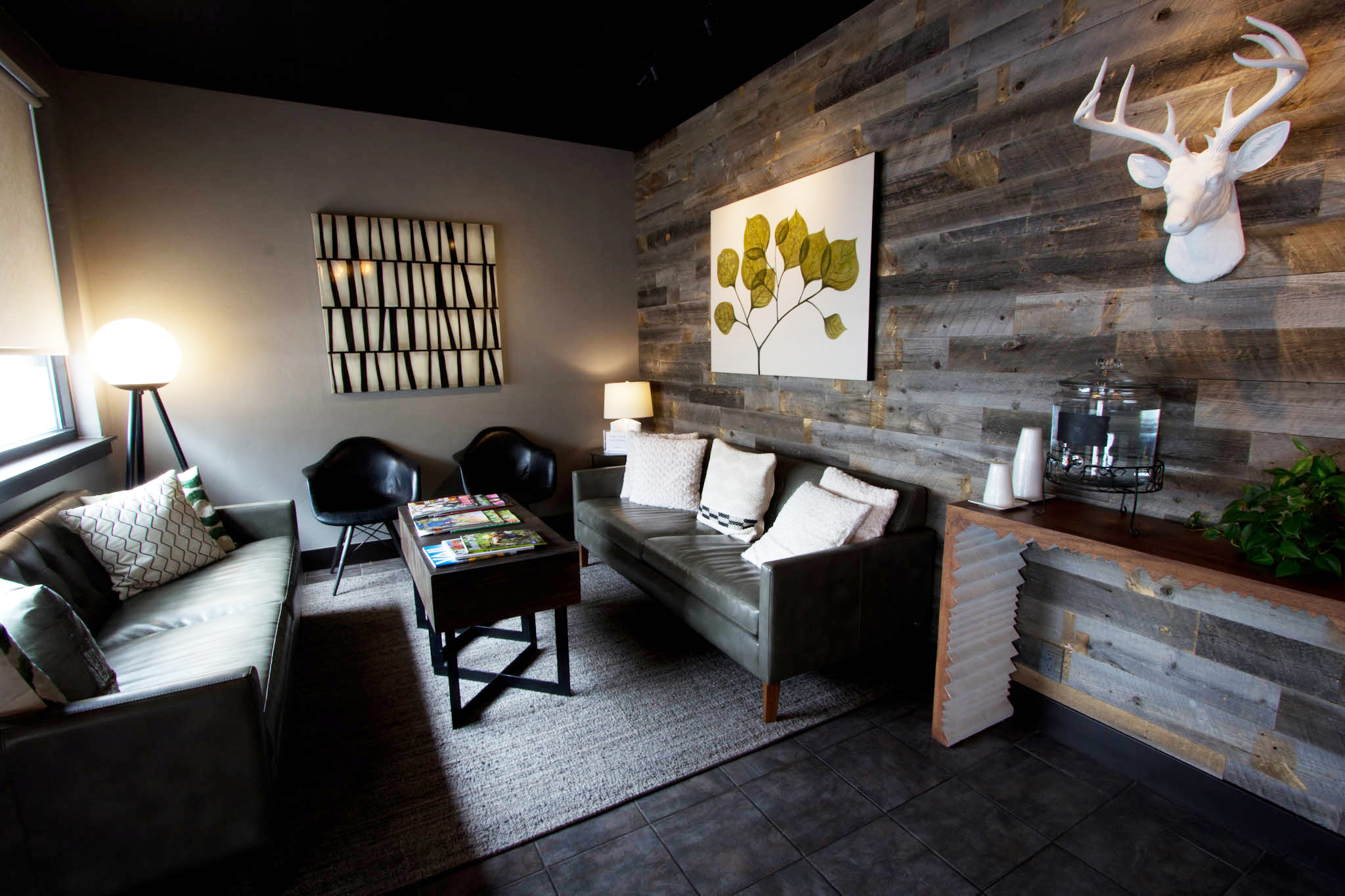
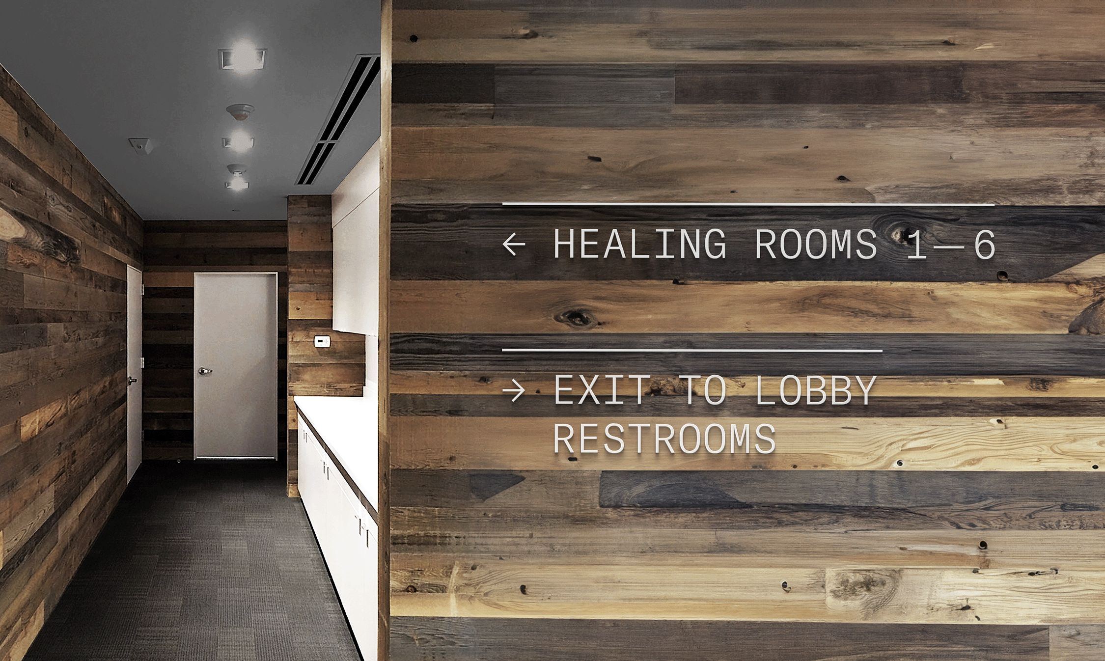
I also had the opportunity to collaborate closely with the owner on interior design choices and signage, creating a welcoming atmosphere through a refined grey and white color palette accentuated by natural reclaimed wood from beetle kill wood of the region. Inspired by the soft, serene hues of the winter Vail mountains, the design was crafted to provide comfort and serenity to clients as they entered, while uniquely complementing the new white and green palette of the branding materials.


BRAND GUIDELINES
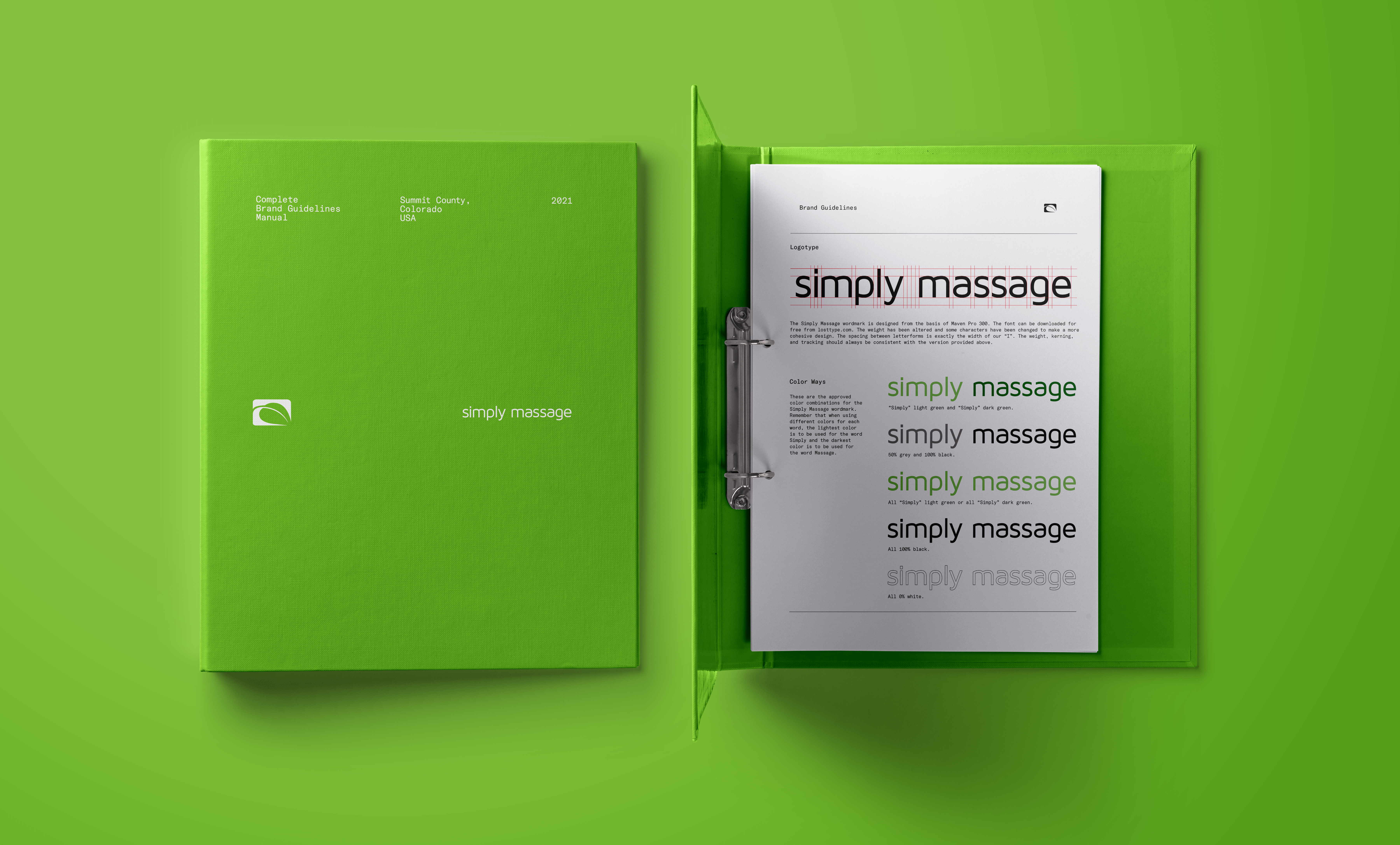
As a thriving massage studio in a tourist-driven area, Simply Massage faced the unique challenge of maintaining brand consistency despite a constantly rotating staff and management. By developing thorough and timeless brand guidelines in the style of established companies of the midcentury, I designed a brand guidline binder that ensured every employee and manager, as well as their visitors get the same level of professionalism, care, and tranquility of experience, regardless of the season, year, or trend. From brand postioning, uniform and digital presence to service standards, these guidelines help streamline onboarding, maintain professionalism, and foster long-term recognition, making Simply Massage a trusted oasis for both first-time and returning guests.


LOGO DESIGNS
Selection of logos and logomarks designed for various clients, coworkers, and friends.
ONGOING
Logos & Branding
Logos & Branding





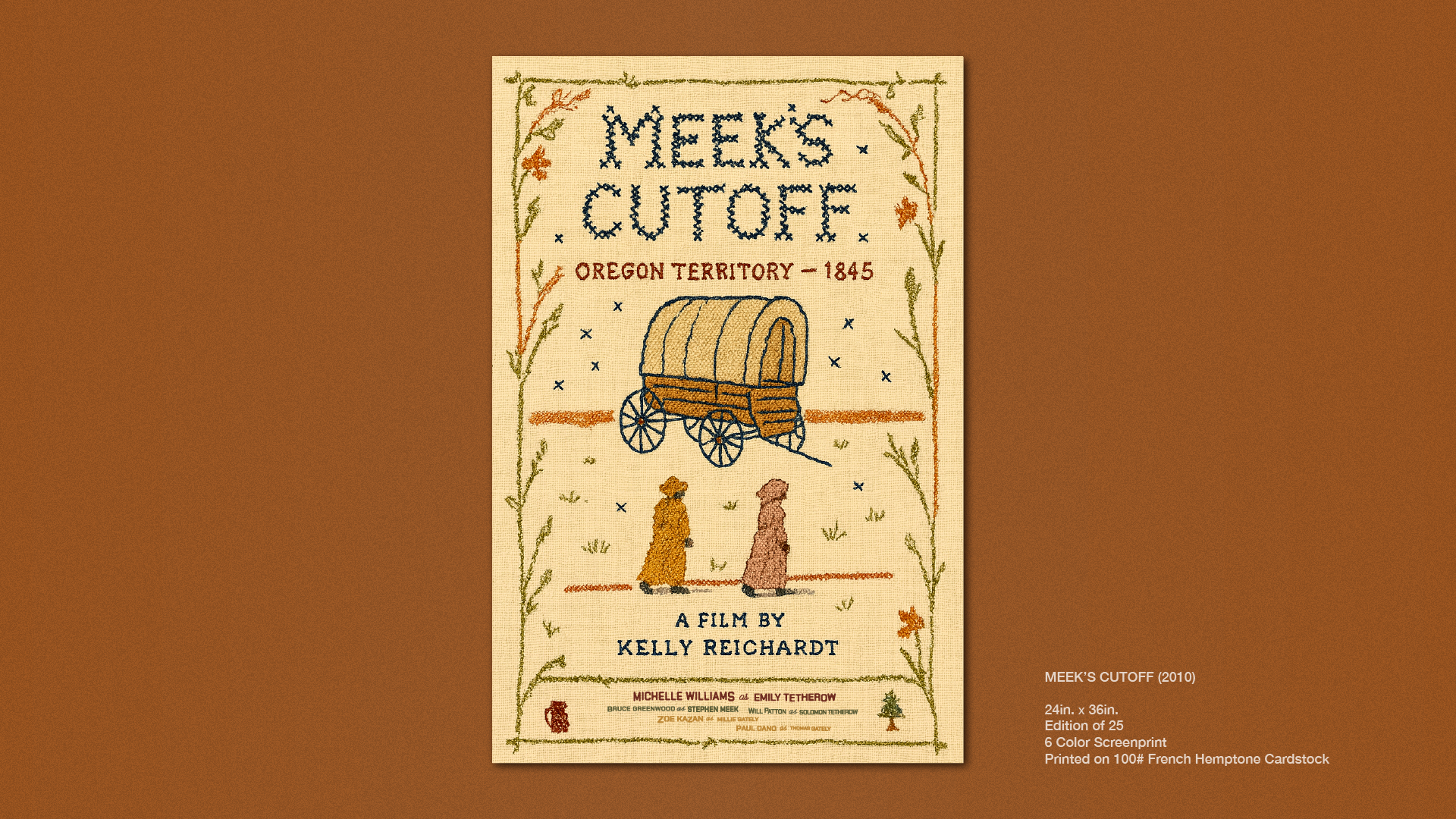
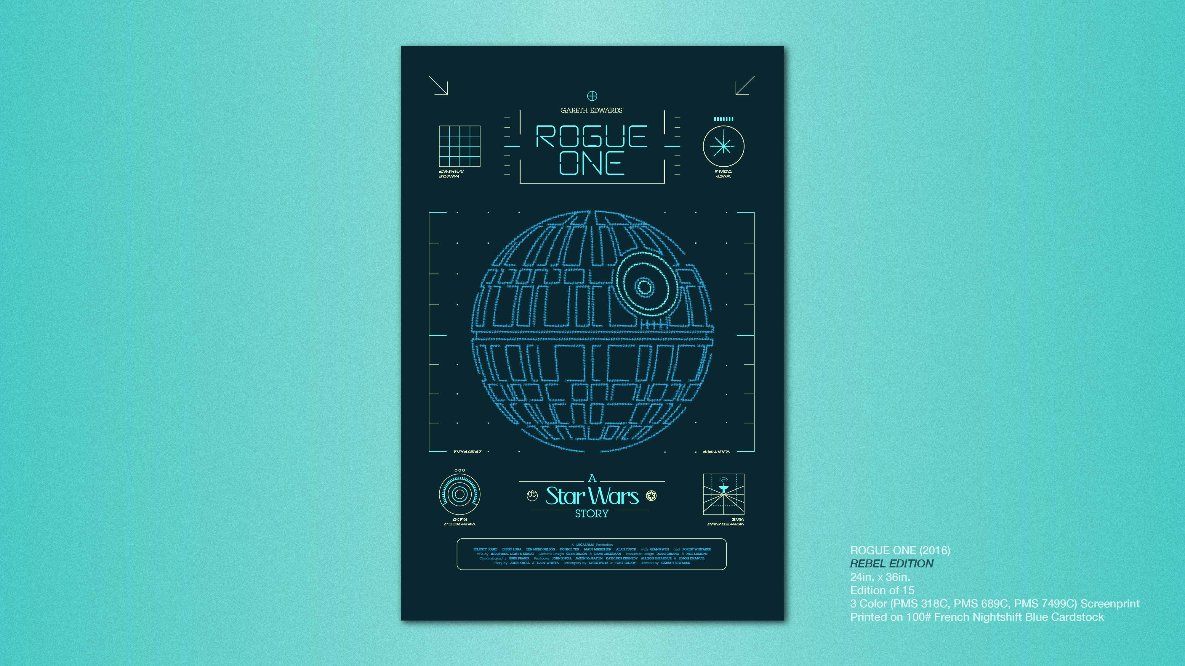
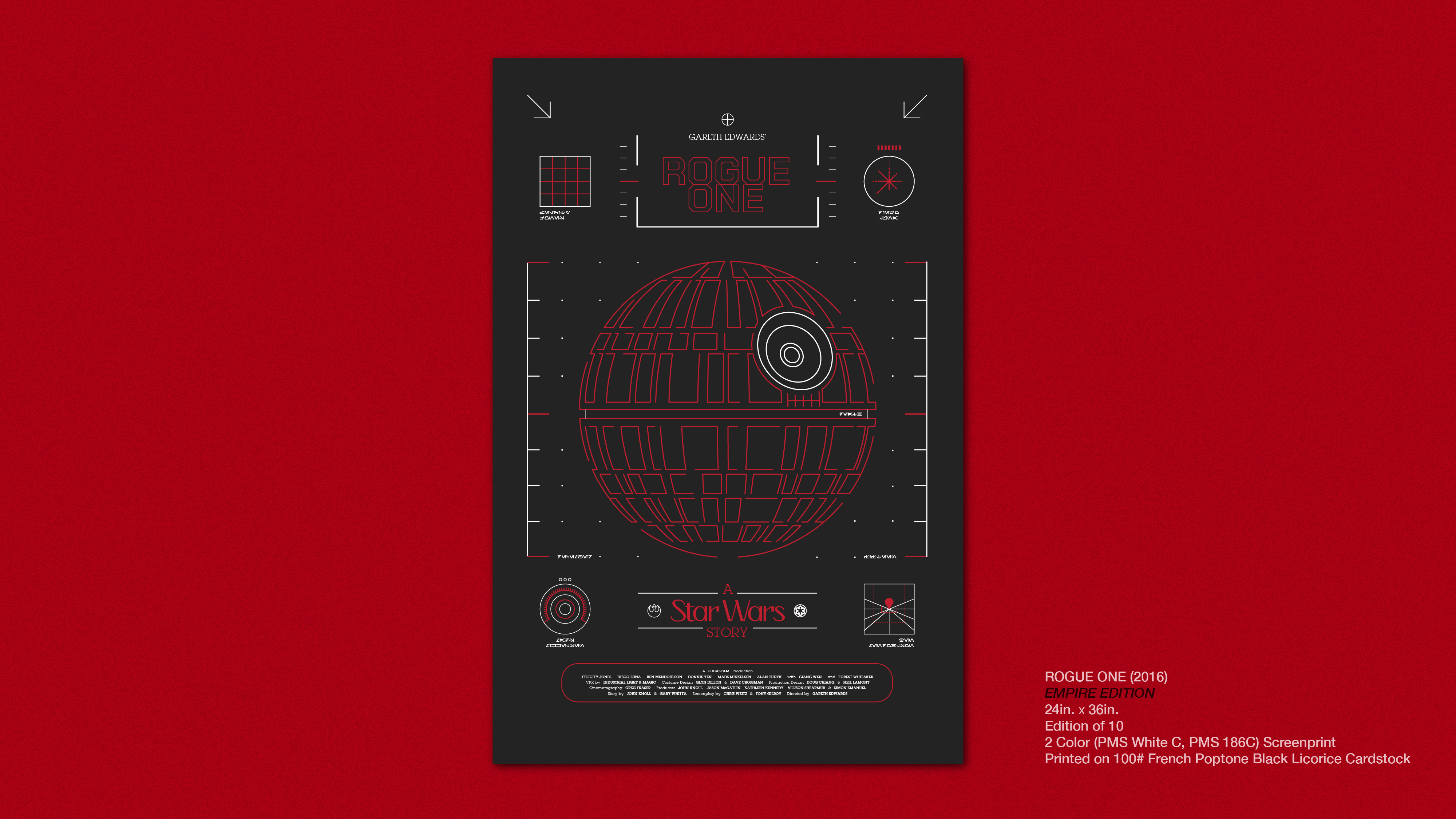
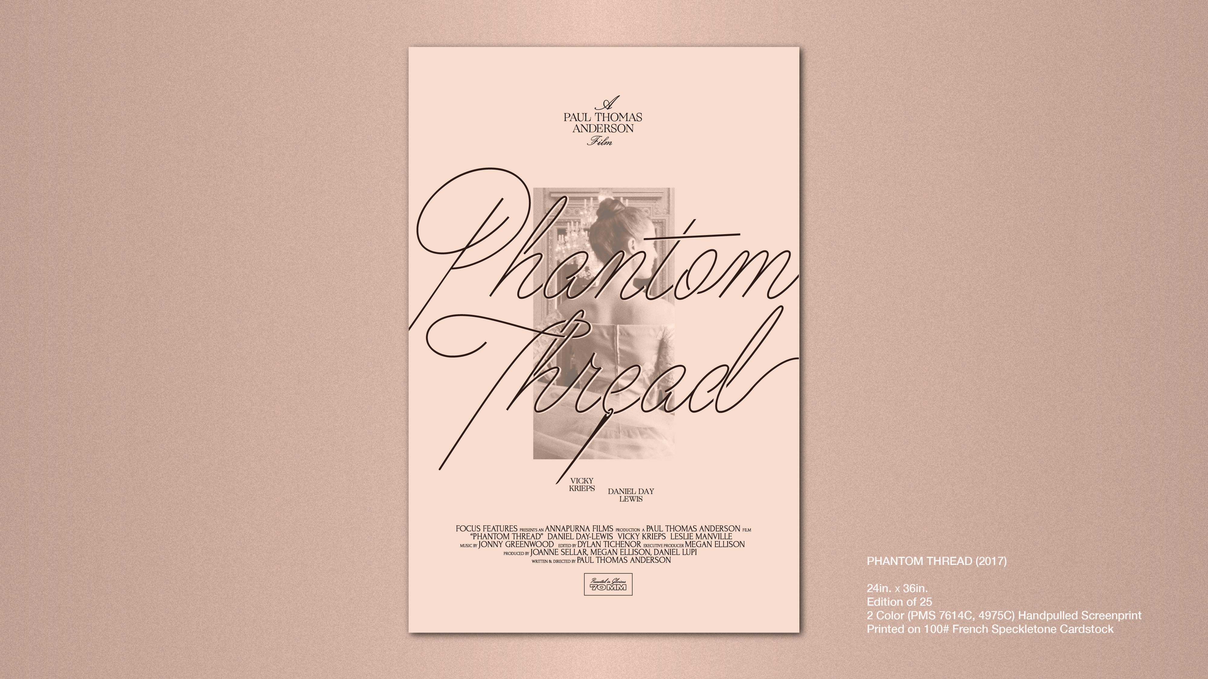
FILM POSTER DESIGNS
Ongoing project of designing and screenprinting film posters for the alternative movie poster community. All posters are screenprinted on 24"x36" stock and include complete custom type and illustrations.
Self-initiated projects for practice in conceptual design, typography, composition and printing.
ONGOING
Typography & Layout
Illustration
Marketing
Screenprinting
Typography & Layout
Illustration
Marketing
Screenprinting
